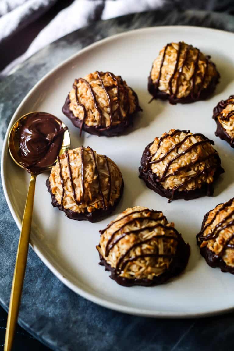
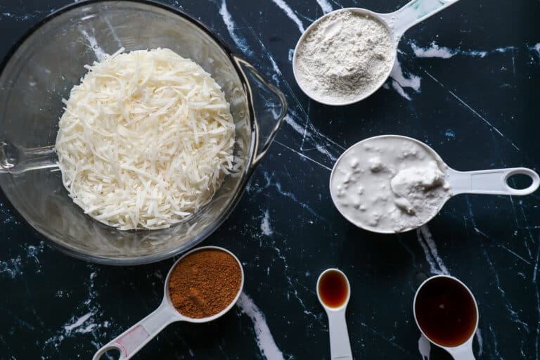
Source: Vegan Coconut Macaroon Recipe


allrecipes.com has an easily navigable site with thousands of recipes and meal preparation videos. The navigation menu is broken down by different categories with sub menus in the form of dropdown menus under each one. It has advanced searching filters for targeted searches and provides some recipes with video instructions.
simplyrecipes.com has an engaging and aesthetically pleasing site. The colors from the images complement the style of the site. It has a main featured recipe and then as you scroll down it has similar recipes, each tagged with the cuisine/type of meal. Each recipe has a star-based rating and time component for users to see at first glance.
epicurious.com has a main search bar that allows the user to immediately search for recipes. The burger menu icon on the left hand side opens up to show more categories. The interior pages have articles that have kitchen tips, cooking advice, and the latest trends and technologies related to cooking. The minimalist design presents the user with a clean and pleasing aesthetic.
politico.com I like the overall simple and clean look of this site and the navigation design of their expandable menu. It occupies the entire screen and holds no visual distractions. Instead, users have straightforward groups of categories to the most important corners of the website.
alfacharlie.co has a very effective design. Their minimalist approach makes the navgiation and overall aesthetic both dynamic and pleasing. One cool aspect is the cursor works as a progress bar which is unique.
Gusto! Their website is bright, colorful, friendly and showcases not just the food but users can get a feel for the atmosphere and energy of the restaurant. The interactions make the pages dynamic. Not only does it include a burger menu icon on the top right of the screen, it also has a footer with all the same links one would find on the expandable menu.